Release Notes - February 2022
Date inputs, table improvements, no spinner design changes, and bug fixes!
We took the shortest month of the year to focus on some general issues in ZUI to improve the quality of the toolkit for our users. While maybe not as flashy, we're still pretty excited for what we're shipping in this release!
Table improvements
If you missed it, we launched the new ZUI Table component in our December 2021 release. We highly encourage you to use this new component, if possible, when building new tables as we'll be continually improving the component over time.
Let's jump into some big changes coming to table this month!
Sortable columns
When we kicked off table, we had a number of features we believed would solve the majority of table use-cases at Zywave today:
- Search
- Basic column layout
- Empty results
- Mobile layout
- Sortable columns
In December and January, we shipped all of those... except sort.
We're happy to say that with this release, we've added the sort feature to ZUI table. To use this feature, you'll be responsible for marking your header row cells with a new sortable attribute. You can also control the initial sort direction with the new sort attribute.
When applied, the cell will become clickable and render the sort direction to the end user. When the user interacts with the cell, we'll dispatch a new sort event from table.
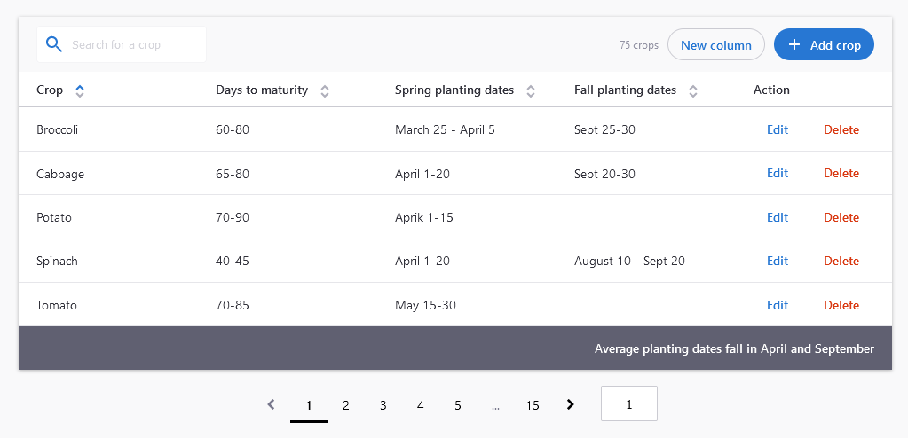
Responsive design fixes
Last month, we brought you the first batch of responsive table features, something notably lacking from the Zywave ecosystem. However, we noticed some small issues with the table topbar component as we approached our release date that we wanted to circle back to address.
Take a look at the before and after below to get a feel for the change:
Unresponsive table topbar

Notice how the search bar in the topbar shrinks to obscure the placeholder text. That is undesirable.
Responsive table topbar
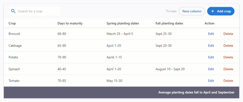
Elements in the topbar now react according to the space available in the viewport.
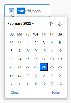
Date input updates
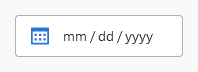
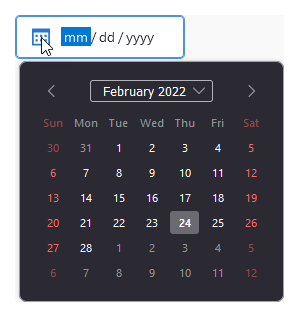
We've long had some design standards around how a date input component should be presented to an end-user. Some curious engineers noticed that the ZUI Input element can be provided any valid HTML Input type, and ZUI Input would work with that best it can. This included date.
Previously unofficially supported, we've now enhanced ZUI Input to present a date input with a calendar icon. Under the hood, this is still only a <input type="date" />. The underlying date picker component that displays is driven by the user agent, so there may be some inconsistencies noticed between a user of Chrome and another of Firefox.
Example of ZUI date picker with Chrome's built-in date picker component.
Example of ZUI date input with Firefox's built-in date picker component.
We also support the min and max attributes with this update:
<zui-input type="date" value="2022-02-24" min="2022-01-01" max="2022-12-31"></zui-input>Block ZUI buttons
With this release, we are also introducing a new ZUI button style variation: block buttons <zui-button block>. This style allows buttons to span the entire width of its parent container. Check out the design guidelines for more details on how to use block buttons.
Introducing ZUI button types and style variations
Adding block buttons gave us the opportunity to improve implementing ZUI buttons. Previously, all button types and style variations were declared with the class attribute. This was confusing since some classes are mutually exclusive e.g., <zui-button class="primary link"> is invalid.
To lessen confusion, we've categorized button types and styles as such:
Button types
<zui-button class="primary"><zui-button type="primary"><zui-button class="secondary"><zui-button type="secondary"><zui-button class="link"><zui-button type="link">Button style variations
<zui-button class="danger"><zui-button danger><zui-button class="icon"> and <zui-button class="icon-only"><zui-button icon><zui-button class="icon-right"><zui-button icon-right><zui-button block>Button types are mututally exclusive from each other, but they can be paired with one or more of the style variations. For example, a common button style we often find in tables within Zywave applications is:
<zui-button type="link" danger>Delete</zui-button>Same old spinner design!
You might be questioning why this is newsworthy. Well, we completely rewrote the ZUI Spinner element, to remove a dated legacy dependency.
You shouldn't notice any UI change with this, however the bundle size did decrease around 15kB in file size. We now only have one more component remaining that continues to use Polymer: ZUI Tabs. Stay tuned for more on that effort in the future.
Documentation updates
We invested a good deal of time again this month on component API documentation, e.g. missing or confusing documentation, better typing information, etc. Be sure to check out our component documentation whenever you have questions about what a particular component can do/be configured to do!
Bug fixes
And, as always, we included a handful of bug fixes with this release. For a full list of all changes included, check out the milestone.