Release Notes - September 2022
Inputs get prefixes and suffixes; analytics adds network connection information; and more!
ZUI Input gets prefixes and suffixes

<zui-input prefix="Mr." value="Anderson"></zui-input>

<zui-input type="number" prefix="$" value="1" suffix=".23"></zui-input>
<zui-input> has been enhanced to support prefix and suffix values, which can be added via HTML attributes or javascript properties. Suffix and prefix can be used in tandem or independent of one another.
Not all input types are supported with this feature, i.e. a color picker would clash visually with where the prefix value would reside. We recommend use of prefix and suffix on only these types: text | number | tel | email | password | url
There is also a shadow part of *::part(prefix) and *::part(suffix) that has been exposed for further style customization.

zui-input.custom-shadow-part::part(prefix),
zui-input.custom-shadow-part::part(suffix) {
    background: var(--zui-blue);
    color: #fff;
}
For examples and more API details see: https://booster.zywave.dev/design-system/components/text-inputs/
Documentation for ZUI Textarea now available
We added the component <zui-textarea> to our design system in June. Today, the ZUI Textarea component page is made available to access API docs and demos. The usage guidelines, such as best practices and design specs, are still in the works, so stay tuned for an update regarding the completion of this documentation!

Exposing network connection information via Zywave Analytics
As individuals who work on software for a living, it is easy to assume that the way we interface with our applications while testing is consistent with the experience of our users, but that's not always the case.
What devices are our users using? Where are they physically when they are accessing our features? Are they in a dedicated office, with an ethernet connection to the corporate network? Are they working from home, maybe from their bedroom, connected to a wireless router downstairs? Or are they on the road, using their phone to shoot off a quick message to a client they will be visiting that day?
With some updates to Zywave Analytics, we hope to offer you some insight into answering those questions. Now, all web-based events that flow through <zywave-analytics> will include the following properties:
| Property name | Details | |
|---|---|---|
networkRtt | The estimated round-trip time of the connection, measured in ms. | |
networkDownlink | Estimated downlink bandwidth, measured in Mbps. Note: Due to privacy concerns, this is capped at 10Mbps . | |
networkReducedData | Indicates that the user has explicitly enabled a setting in their browser to reduce data usage (e.g. mobile connections) | |
networkConnectionType | Indicates how the user's device is connected to the network (e.g. ethernet vs wifi). Note: This will commonly be omitted due to device privacy concerns. |
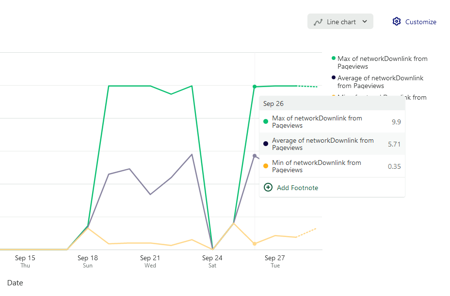
Additionally, our team now has a Heap report to compare Min/Average/Max downlink connections so that we can get a good snapshot of our users. Feel free to take a look, and repurpose for your team's needs!
ZUI Input File now supports file drag and drop
Now users of <zui-input-file> can drag and drop a file from their file explorer onto the web component and the file will be attached and name reflected in UI.
This is a default behavior of zui-input-file, no setup needed to use. A reminder that this component currently only supports a single file selection, therefore users dragging multiple files out onto the component will result in nothing, it will remain in its previous state.

ZUI Select and Select Dropdown advanced styling support
We've added a minor enhancement to zui-select and zui-select-dropdown to expose a shadow part to enable much more styling options upon the 'control' element within the shadow DOM.
.my-zui-select-dropdown::part(control) {
    transition: border 1000ms ease-in-out, box-shadow 1000ms ease-in-out;
}
See documentation page for API and demo details: https://booster.zywave.dev/design-system/components/dropdown-selects/
Additional features and fixes
As always, feel free to check out our GitLab milestone for more details!