Introducing Booster Development Network
A new site to enable engineers to build consistent, quality applications aligned with the Zywave brand.
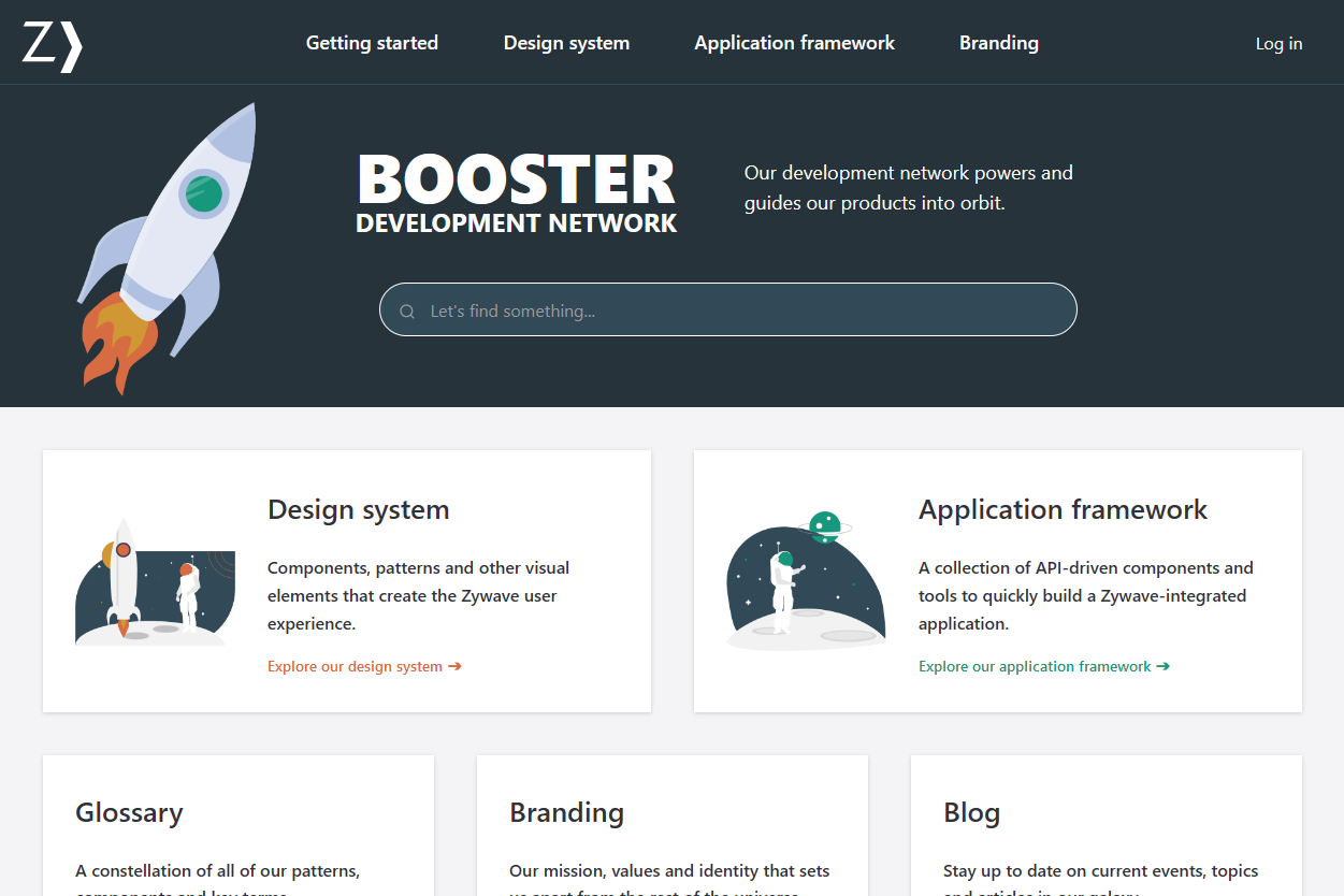
A few months ago, we gave a preview of the successor to the ZUI (Zywave User Interface) and ZAPI (Zywave API) docs: Booster Development Network. Today, we're happy to announce that it has finally been released!
How it started
During Q3 2020, we sent out a survey asking about how using the ZUI Toolkit and documentation site has affected you and your teams. We were happy to learn that ZUI has made a positive impact from the survey results! Despite the positive feedback, there was still room for improvement; such as addressing the lack of demos and how difficult it was to find specific information. With this feedback, we held several round table discussions during Q4 2020 to gather more feedback regarding these pain points.
Thanks to your participation and feedback, we spent a good chunk of 2021 re-imagining how we can make documentation more accessible to you.
One documentation site to rule them all
After the inception of ZAPI a couple years ago, it was still relatively unknown compared to ZUI, which has been around for almost a decade. Most did not know ZAPI documentation existed, which was a problem since a lot of our applications have now adopted components such as Zywave Shell. It only made sense to combine both documentation sites into one with how intertwined they are. Using eleventy, a lightweight and framework-less static site generator, we were able to quickly get the Booster Development Network site up.
Initially, we tried to merge both ZUI and ZAPI components into one category, but that did not make any sense and just created more confusion. It made more sense to house them both under the same roof, but in different rooms. ZUI will now be referred to as "design system" and ZAPI as "application framework" to reflect their purposes.

The convenience of having one documentation site is so that we can invest more time into the experience, such as providing better API docs, demos, and a robust search. The Product Design Team has also taken this time to polish our design guidelines using the new content management system we implemented.
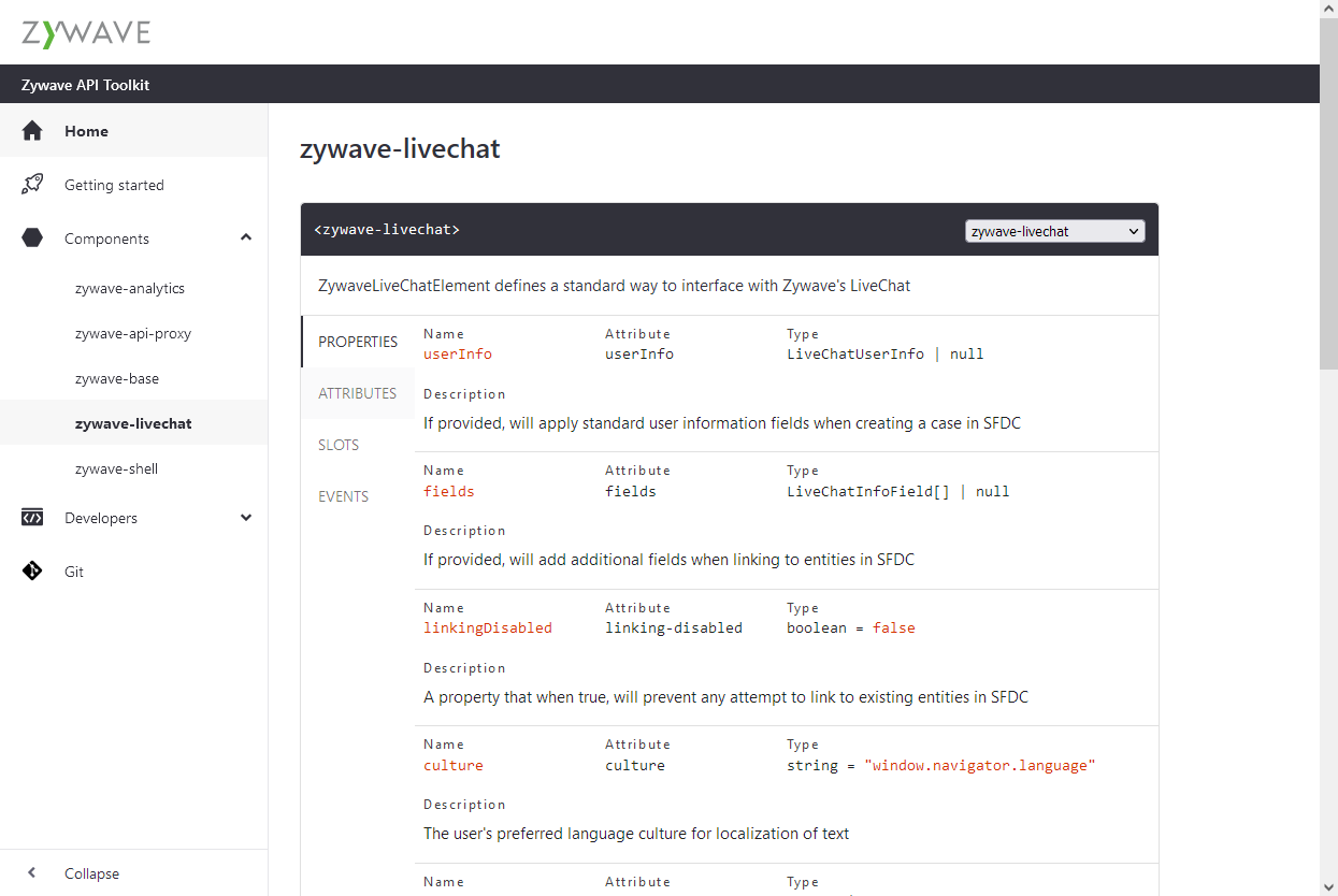
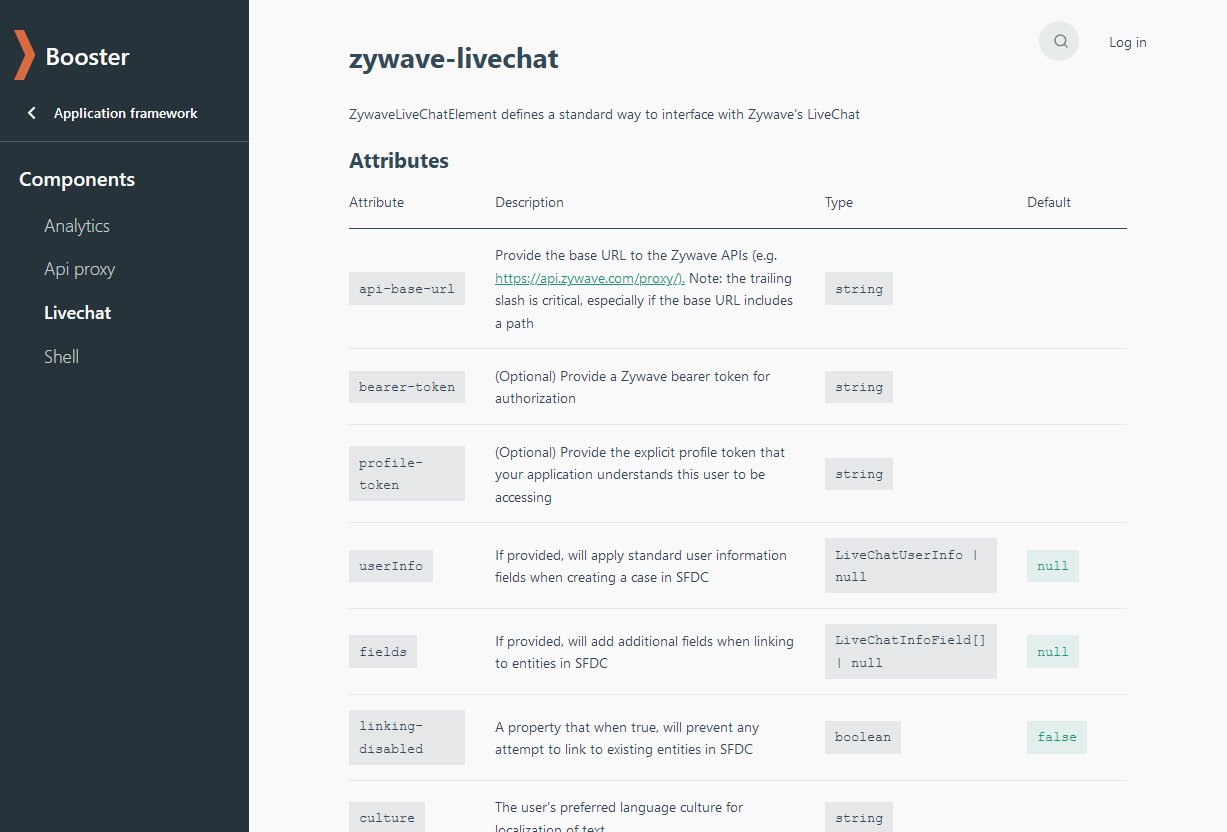
Beautifully formatted API docs
Previously, we were using a third-party tool to display our API docs, but the user experience was confusing. This made it difficult to surface the valuable information that engineers need. We decided to build our own API formatting tool using custom-elements-manifest so we can control the format to make it easier for engineers to find the data required to interact with our components.


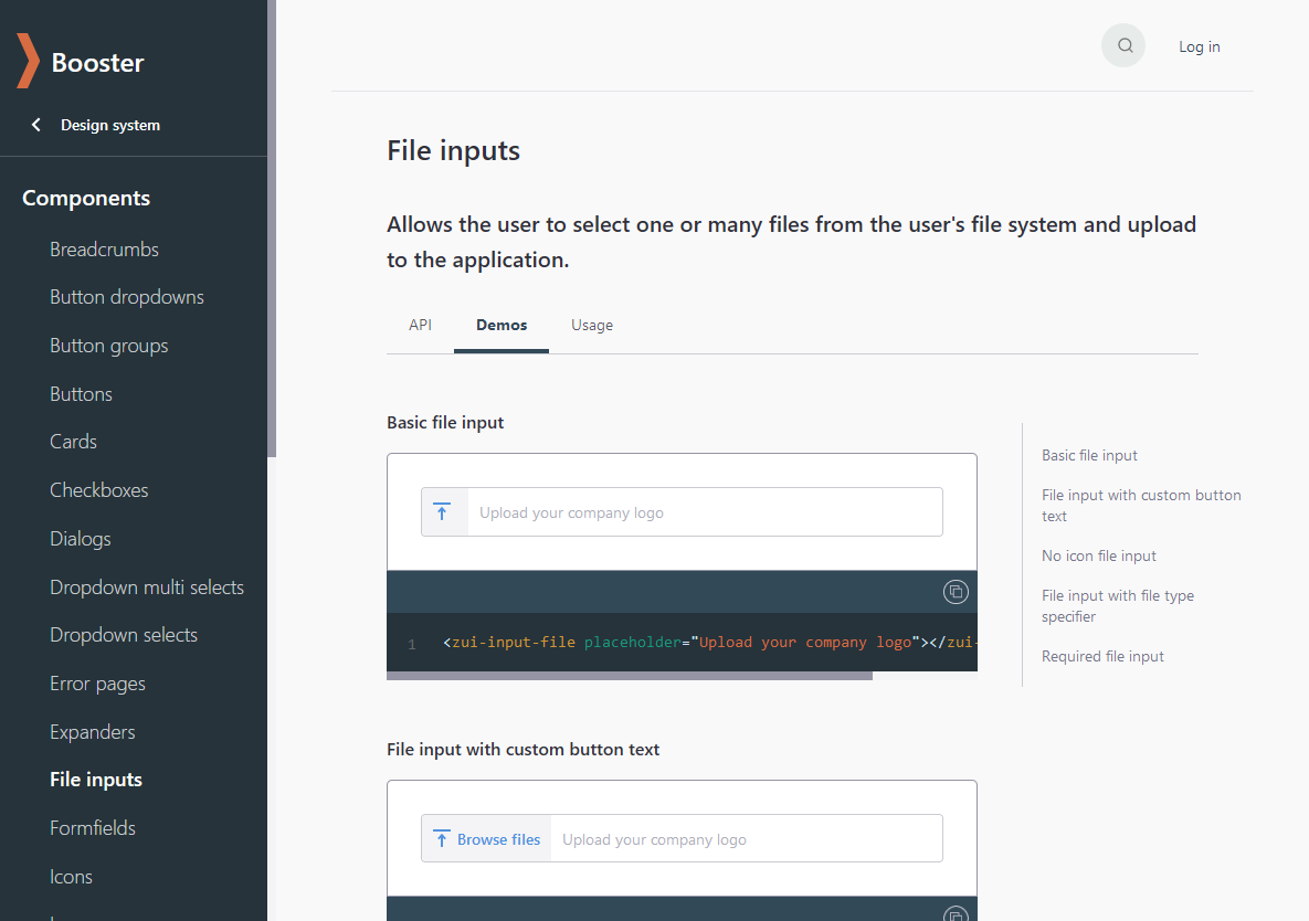
Demos and code snippets
One major request we received from the survey and round table discussions last year is examples with code snippets on the documentation site would greatly improve the development experience. ZUI and ZAPI authors are often asked for examples and engineers have resorted to referencing the source code, which is not ideal. We want our documentation site to be helpful! Now all of our components have fleshed out demos for almost every scenario you can use them in and code snippets you can copy to your clipboard! (A few components, such as
In our effort to keep these up to date as our components evolve, we've added these demos to our component packages so the documentation site gets instant updates. (We're actually dynamically pulling demos and API docs directly from our CDN, which is really cool.)
Search
Adding a robust search is one of our top favorite improvements to the documentation site. We're using Algolia + Netlify, which is a flexible and powerful search plugin for Netlify apps, to instantly deliver search results. It's actually impressive how the search can distinguish results between tabs within pages. We encourage you to give it a shot!

Content management system
A big pain point that we did not highlight previously is how difficult it was for the Product Design Team to contribute documentation. Previously, they had to learn Markdown, Git and the peer review process in GitLab to name a few. It was quite the learning curve! They won't have to write Git commands ever again thanks to Netlify CMS, a content management system for static site generators. Netlify CMS builds a user-friendly UI on top of the Git workflow. One of the best things about it is the preview pane. You get a real time preview of your content while you're typing in the rich text editor before it is published to the documentation site! And if you'd rather just write that markdown, you can still do that, too.
What about zui.zywave.com?
We are deprecating https://zui.zywave.com. In October, it will redirect to https://booster.zywave.dev.
What's next?
This is just the MVP release. There are a few loose ends we are tying up, such as:
- Fixing some broken styles and demos.
- Adding custom web components to the CMS to make formatting our documentation easier.
- Improving design guidelines, design specs, and imagery.
The Product Design Team is also finalizing a new look for the site!
