Zywave, Inc.Zywave, Inc.Zywave, Inc.Zywave, Inc.
Add To Action ItemsA clipboard with a plus in the corner to indicate adding to action itemsAddAn addition symbolBuildingAn illustrative icon of a buildingCalendarA gridded day calendarCaret DownTriangle pointing downwardCaret LeftTriangle pointing leftCaret RightTriangle pointing rightCaret UpTriangle pointing upCheckCheckmark iconChevron DownA chevron pointing downChevron LeftA chevron pointing leftChevron RightA chevron pointing rightChevron UpA chevron pointing upCopyTwo overlapping rectangles to indicate a copyDeleteTrashcan iconDetailsA circle with a lowercase "I" in the middle to indicate infoDocDocument icon with lines on itDouble Chevron LeftTwo chevron arrows pointing leftDouble Chevron RightTwo chevron arrows pointing rightDownChevron arrow pointing downDownloadAn arrow pointing downEditA pencil illustrationErrorAn octagon with an ! within it to indicate a errorExcelA document shaped paper with an X on it to indiciate it's an Microsoft Excel fileExternalTwo squares, one overlapping the bottom one. Top square has an arrow pointing away, as if leading you awayFile DropA folded page with a line through it inside of a folder to indicate a file being dragged and dropped to a destinationFilterA funnel style filterFolderA folder iconGridFour squares with space between them to indicate a gridGripA grid of six squares to illustrate something that has texture or grippableAdd to GroupA stack of pages with the corner folded and a plus sign in the corner to indicate adding to a groupHelpA question mark within a speech bubbleImpersonationA figure wearing a mask to disguise their faceAdd IndicatorA circle with a plus in the middle, to symbolize an additive action.Backslash IndicatorA circle with a slash in the middle, to symbolize something isn't allowed.Failure IndicatorA circle with the letter X in the middle, to symbolize failure.Remove IndicatorA circle with a minus in the middle, to symbolize removal.Success IndicatorA circle with a checkmark in the middle, to symbolize success.Warning IndicatorA triangle with an ! within it to indicate a warningInfoA filled circle with the letter I cut out from the center, to symbolize informationLeftAn arrow pointing leftLinkA chain linkListA list of itemsLockA paddle lockMailA mailing envelopeMoreThree dots, like an ellipsisMove ToAn envelope with an arrow pointing to the rightMP3A document shaped paper with MP3 on it to indicate the file is a .MP3MP4A document shaped paper with MP4 on it to indicate the file is a .MP4Multiple FilesA document icon with lines and another document behind it to signify multiple documentsNew FileA folded page with a plus in the corner to indicate a new fileNew FolderAn envelope with a plus sign in the corner to indicate a new folderPDFA document shaped paper with the letters PDF on it to indicate the file is a .PDFPhoneA telephone handset that is ringingPowerpointA document shaped paper with the letter P on it to indicate the file is Microsoft PowerpointPrintOffice printerRefreshAn arrow in the shape of a circle to indicate refresh or reloadRemoveAn X iconRenameA rectangle with a capitalized "I" through it to indicate renamingReportingAn outline of a graph with barsRightAn arrow pointing rightRocketA cartoon rocket shipSearchA mangifying glass icon, to indicate searching for somethingShareA document with an arrow emerging from the content on the page. Indicates sharing contentsShared With YouA circle above a curved line, like a person holding something. Above the line is a curved arrow pointing to the right.SortUp and down arrows pointing away from one another to indicate sorting or re-sortingSuccessA circle with a checkmark within to indicate a successSwitch profileArrows pointing different directions, indicative of switchingTableFour horizontal lines with space between them to indicate a tableUnlockAn unlocked paddle lockUpAn arrow pointing upUploadAn arrow facing upUserAn outlined silhouette of a personVideoA document shaped icon with a triangle on it, indicating a video fileWarningA triangle with an ! within it to indicate a warningWordA document shaped paper with the letter W on it to indicate the file is a Microsoft Word docWrenchA toolbox wrench
Blog

Release Notes - January 2022

Table gets mobile friendly, select all coming to a dropdown near you, and more!

Release Notes

The first updates of the 2022 year are coming out on January 25th, and we've got some pretty awesome features to go over!

ZUI Table is now mobile responsive

Last month, we released ZUI Table. Now that we have an HTML design standardized, we're adding a commonly neglected feature of tables in our products: making them work on mobile. With no extra work from you, ZUI Tables in your app will now look appropriate when rendered at mobile resolutions.
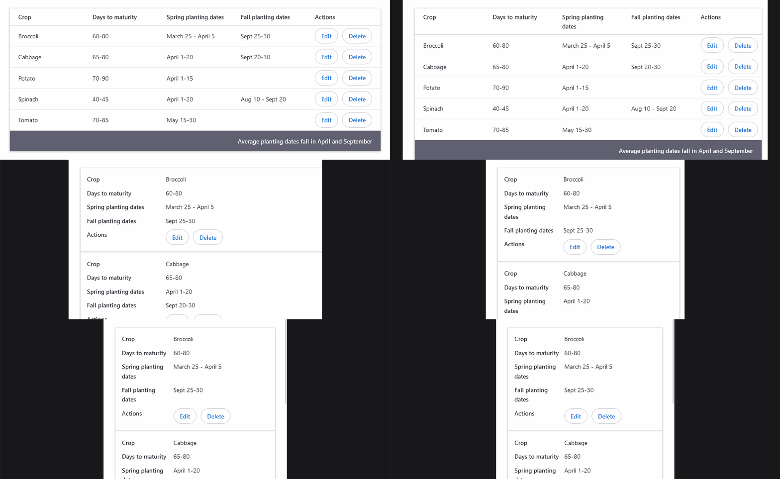
Table shrinking from desktop to mobile layout

ZUI Dropdown Multi-select enhancements

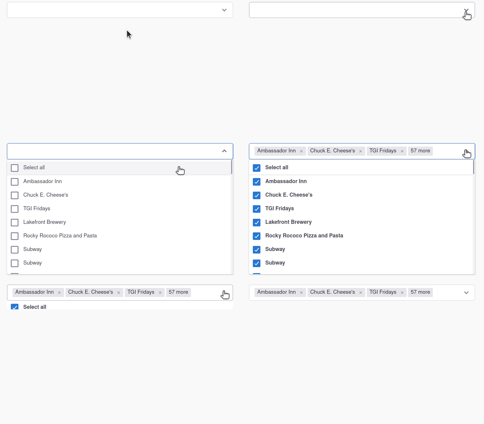
Select all support

This feature has been commonly requested since the initial release of this component. With this update, you'll be able to utilize "Select all", and even have control on how that is reflected back to you.

<zui-select-dropdown 
multiple
enable-select-all
select-all-option-label="Select all">

<!-- <zui-option> elements -->
</zui-select-dropdown>

Truncated selection tags

With the "Select all" enhancement, we quickly realized the result list can get quite large. This is currently an issue today, but we believe "Select all" will only exacerbate the issue.

So, you can now opt-in to limit the number of selection tags that are displayed in the result list.

<!-- 
For the purposes of the demo, maximum-results-display-count is set to 3.
We don't recommend such a low number. -->

<zui-select-dropdown
multiple
maximum-results-display-count="3"
truncated-result-message-format="{0} more">

<!-- <zui-option> elements -->
</zui-select-dropdown>

Now, to see them both in action!

Select all demo video

ZUI Dialog goes native

Did you know that browsers have a built-in dialog component? While currently only Chromium has implemented and shipped this component, Firefox and Safari are on track to release their implementations this year. Conveniently, Chrome also provided a nice dialog polyfill.

We experimented with the native dialog and polyfill when implementing our feedback component in the Booster documentation site, and we're now ready to start experimenting with a new implementation of ZUI Dialog based on this native component.

Why are we changing ZUI Dialog? There are actually two reasons for us:

  1. ZUI Dialog is currently based on Material Web's dialog, which unfortunately limits our ability to push our own design standards, like sticky footers.
  2. Having the 3rd-party dependency puts our library at risk with respect to dependency management and additionally bloats our code base more than we'd like.
    • When we ship the native dialog, we'll shave off 43kB from our bundle (from 48kB for the current dialog implementation alone to 5kB)!

If you'd like to experiment with our implementation, and you currently use zui-bundle, you can do this via DevTools (will require a refresh):

// this will persist to localStorage
window.zywave.zui.flags.enableDialogNative = true;

// to revert to the current implementation
window.zywave.zui.flags.enableDialogNative = false;

We'd appreciate people trying this out and letting us know if their dialogs break in any way, as we intend to make this the default implementation as early as March 2022.

More documentation updates

We've continued to enhance our current documentation, with several usage updates to dialogs, notifiers, text inputs, and more.

Additionally, we have worked to continue to improve our API documentation for our components. You should notice that method documentation is improved with a "Signature" column, and a lot of missing API documentation has been added as well!

Other updates

  • Zywave Shell had some work put in to improve its loading lifecycle. You now have more visibility into the state of Shell as it loads required and supplemental data and code. See Zywave Shell's API documentation for more information.
  • Fixed an issue where form controls with the same name could interfere incorrectly with form submission data (most noticeable in ZUI Checkbox).
  • Added the ability to override the colors and logo in Zywave Shell client-side.