Release Notes - May 23, 2024
Addressing a few bugs and adding new features to ZUI Table, ZUI Shell, and more.
This release addresses a couple bugs and adds new features to ZUI Table, ZUI Shell, and more.
Bug fixes
Closing Dropdown Multi-select and Dropdown Selects now works as expected
Previously, the component <zui-select-dropdown>'s options list would not close when clicking outside of the element after opening it via the chevron icon. This has been fixed and the dropdown will now close as expected.
<zui-select-dropdown>? Dropdown Multi-select requires the multiple attribute: <zui-select-dropdown multiple>.
All options now shown in a searchable Dropdown Select options list after a selection has been made
In a searchable Dropdown Select <zui-select-dropdown>, the options list would not show all options after a selection has been made. Users had to clear the selection in order for the options list to show all options again. This has been fixed and the options list will now show all options, including the selected option, to allow users to view all the options in order to make a different selection.
<zui-dropdown-select placeholder="Choose a Wisconsin city" searchable>
  <zui-option value="Appleton">Appleton</zui-option>
  <zui-option value="GreenBay">Green Bay</zui-option>
  <zui-option value="Madison">Madison</zui-option>
  <zui-option value="Milwaukee">Milwaukee</zui-option>
  <zui-option value="Wausau">Waukesha</zui-option>
</zui-dropdown-select>
Preventing CSS animations from running when DOM is destroyed and recreated
Both the <zui-checkbox> and <zui-radio> components would run their "checked" or "selected" CSS animations whenever the DOM was destroyed and recreated repeatedly. A check has been put in place to ensure that a change event occurs to trigger the CSS animations going forward.
Enhancements
ZUI Table now supports ZUI Button Groups in the topbar
<zui-table> now supports <zui-button-group>s in the topbar action slot. This allows users to add a medley of actions to ZUI Table.
<zui-table>
  <zui-table-topbar>
    <zui-button-group slot="action">
      <zui-button>Button 1</zui-button>
      <zui-button>Button 2</zui-button>
      <zui-button>Button 3</zui-button>
    </zui-button-group>
  </zui-table-topbar>
</zui-table>
Learn how to build a <zui-table> here.
Features
New shell banner component added to ZUI Shell
A new subcomponent of ZUI Shell has been added called <zui-shell-banner>. This component is used to display important information or messages at the top of applications.
Similar to ZUI Wells, the <zui-shell-banner> component has a type attribute that can be set to info, success, warning, or error to change the background color to indicate the severity of the message.

<zui-shell>
  <zui-shell-banner type="warning">
    Our website will be undergoing scheduled maintenance from 10pm-2am EST.
  </zui-shell-banner>
</zui-shell>
Learn how you can implement the new <zui-shell-banner> here.
Loading state added to ZUI Table
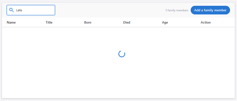
A loading state has been added to <zui-table> to indicate to users that data is being fetched or processed. This state can be triggered by setting the loading attribute on <zui-table>.

<zui-table loading>
  <zui-table-row>
    <zui-table-cell></zui-table-cell>
  </zui-table-row>
</zui-table>
Learn more about the new loading state for <zui-table> here.
