Release Notes - March 2026
zui-flyout is now generally available with a new controlslist attribute, zui-formfield gains tooltip and required-field decoration support, plus other enhancements and bug fixes.
Enhancements
zui-flyout becomes generally available
Back in September 2025, we debuted a preview version of <zui-flyout>. Since then, we've been fixing bugs and providing general improvements, and we're excited to say that with this release, the toolkit component is complete!
Customize flyout controls with controlslist
<zui-flyout> supports a controlslist attribute, similar to the controlslist property on media elements. It accepts a space-separated list of tokens. Currently the only supported token is noclose, which hides the close button in the flyout header while still allowing the flyout to be closed programmatically.
<zui-flyout controlslist="noclose">
    <h1 slot="header">Flyout without close button</h1>
    <p>This flyout has no close button, but it can still be closed programmatically.</p>
    <zui-button slot="footer" type="primary">Close</zui-button>
</zui-flyout>
There remains work to document usage and design standards, but for teams interested in using the component, feel free!
More standardized zui-formfields
<zui-formfield> received some attention this release. This component exists as an opinionated wrapper of a "form control", such as an input.
To lean further into these opinionated designs, we added support for some common use cases that were difficult to do within the confines of <zui-formfield> and often required developers to not use the component at all.
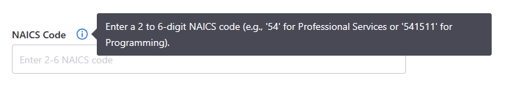
Additional context support with zui-tooltips
We've added the ability to optionally supply a tooltip message to a formfield for additional context. This results in ZUI placing the <zui-tooltip> element and icon exactly where we recommend it being placed.
<zui-formfield
    label="NAICS Code"
    tooltip="Enter a 2 to 6-digit NAICS code (e.g., '54' for Professional Services or '541511' for Programming).">
    <zui-input
        type="text"
        inputmode="numeric"
        minlength="2"
        maxlength="6"
        regex="^[1-9][0-9]{1,5}$"
        placeholder="Enter 2-6 NAICS code">
    </zui-input>
</zui-formfield>
Automatic required field decoration
It's been a long encouraged practice to denote form controls that are required with a red asterisk (*). We've added some helpful CSS to zui-formfield to automatically decorate the label it controls with that UI denotation if the provided form control is marked as required.
<zui-formfield label="NAICS">
    <zui-input required></zui-input>
</zui-formfield>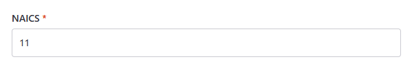
Expanded no results message support in zui-select-dropdown
The no-results-message attribute on <zui-select-dropdown> previously only applied to empty groups inside a grouped dropdown. It now works across all dropdown configurations.
In a flat (non-grouped) dropdown, the message appears when there are no options or when typeahead filtering yields no matches. In a grouped dropdown, each group that has no matching options shows the message individually — unless hide-empty-groups is set, in which case a single message is shown in place of the hidden groups.
<zui-select-dropdown no-results-message="No options available">
    <zui-option value="1">Option 1</zui-option>
    <zui-option value="2">Option 2</zui-option>
</zui-select-dropdown>
zui-dialog max-width overridable with CSS custom property
The max width of <zui-dialog> can now be overridden with the CSS custom property --zui-dialog-max-width. The defaults are 675px for a standard dialog, 475px for a small dialog, and 875px for a large dialog — use this property when none of those fit your use case.
<style>
    zui-dialog {
        --zui-dialog-max-width: 70vw;
    }
</style>

<zui-dialog>
    <h1 slot="header">Custom max width dialog</h1>
    <p>This dialog has a max width of 70% of the viewport width.</p>
    <zui-button slot="footer" type="primary">Close</zui-button>
</zui-dialog>
Additional minor enhancements to other Booster components
<zui-button>- Added danger support to secondary buttons.<zui-button type="secondary" danger>Delete</zui-button><zui-error-page>- text links are now styled with ZUI Blue 500 and have the underline text decoration to align with our design system.<zui-expander>- Made the entire standard group expander trigger have the pointer cursor, not just the down arrow.<zui-radio>- Gallery radio buttons will now hide the icon slot if there are no slotted icon elements.<zui-dialog>- Text color is now default to ZUI Gray 800 to match the rest of our design system (previously it was the default text color of the browser, which is often black).
Bug fixes
zui-table race condition bugs
- Fixed a race condition in
<zui-table-row>where the initial sort state could be applied incorrectly on first render, causing sortable columns to be overlooked or fall out of sync. - Fixed an issue where mobile row headers were not reliably injected into
<zui-table-cell>on initial render, due to aMediaQueryListlistener that only fired on viewport changes rather than on load.
Form-associated custom element + fieldset interop issue
We resolved a somewhat nasty bug when using ZUI elements that are form associated (e.g., <zui-input>) within a <fieldset> element. The issue could be reproduced by disabling and re-enabling the <fieldset>, which would leave the form control in a disabled state.
See also: https://github.com/whatwg/html/issues/8365.
Deprecations / removals
None!
Other
<customelement-manifest-element> was updated to support markdown used in JSDoc descriptions on properties, methods, etc.
This element is used by the Booster documentation site to render custom element manifests for our component API documentation.