Usage
A Builder divides the work of creating content into a sequence of steps, which allows the user to focus their attention on each task individually.
Steps
There are 4 common steps used in the Builder pattern. Choose the steps that best fit your desired workflow. Following the steps outlined in this pattern creates a consistent and familiar document creation process for users.
The 4 steps include:
- Kickoff
- Setup
- Data Entry
- Generation
For detailed documentation on our Builder steps, view the Builder design specs.
Kickoff (optional)
The first step is the Kickoff. It contains a high-level action to start the workflow. Kickoff can take place within the tool or from an account page.
Consider the following when configuring the Kickoff step:
- How will the Builder launch?
- Does the user need to return to a home page to view a previously created project?
Actions
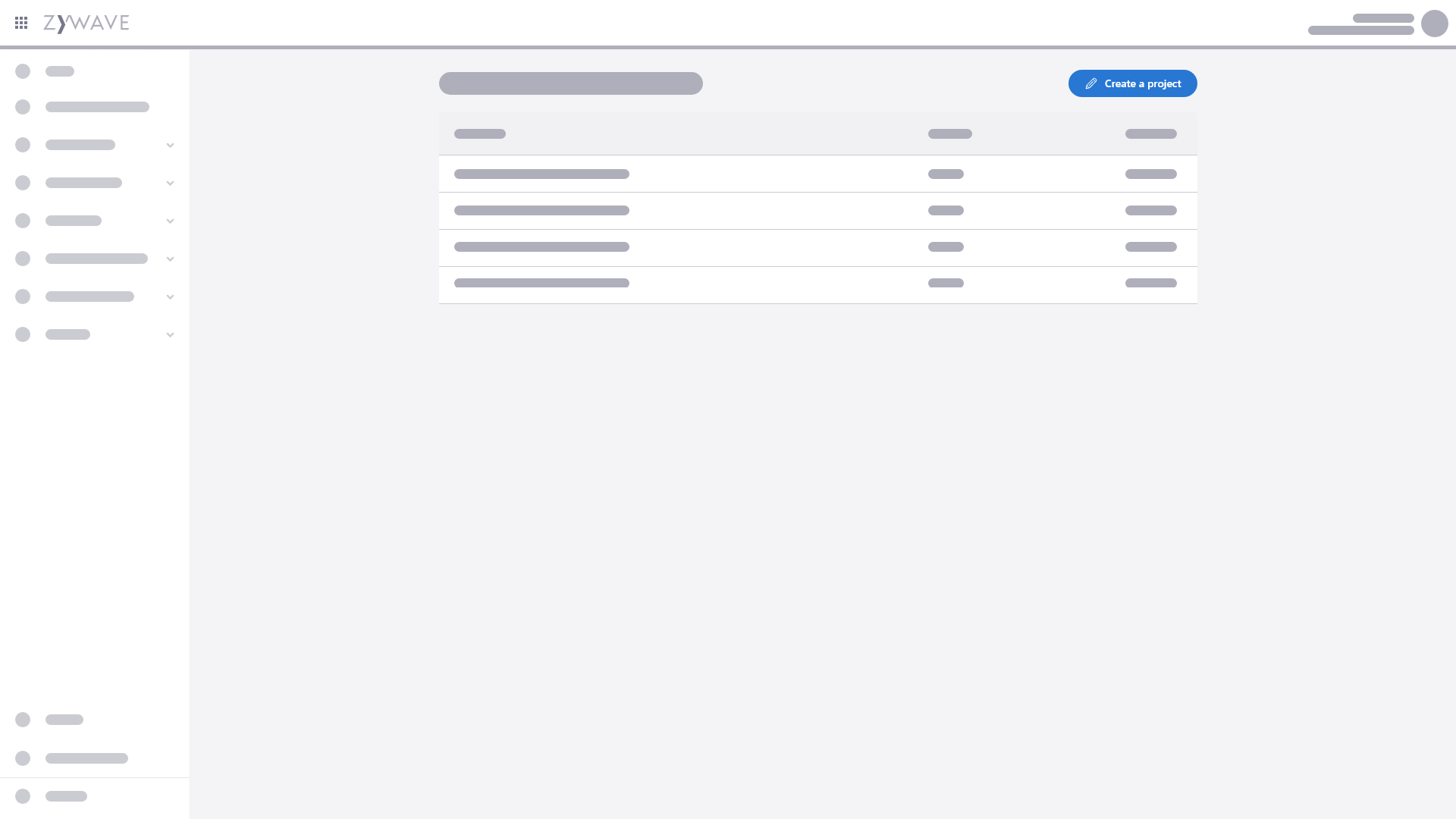
Typically, page-level actions should be placed in the top right corner to start a workflow. Use a table when the user needs to return to a previous project. This is also helpful for downloading, editing, and duplicating projects. If the table is empty, use an empty state in the table.
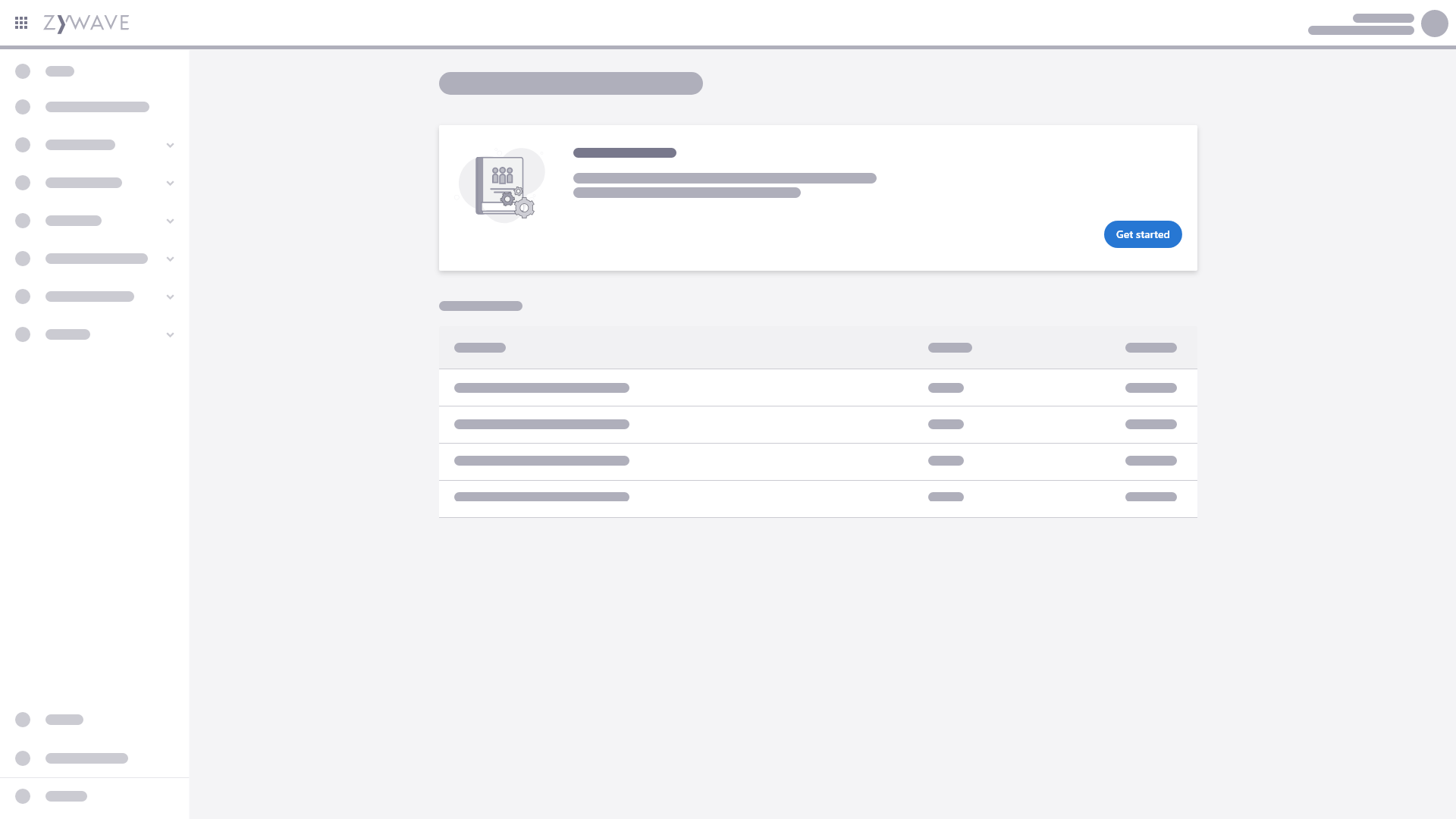
Actions within a card can be used to place more emphasis on the high-level actions.
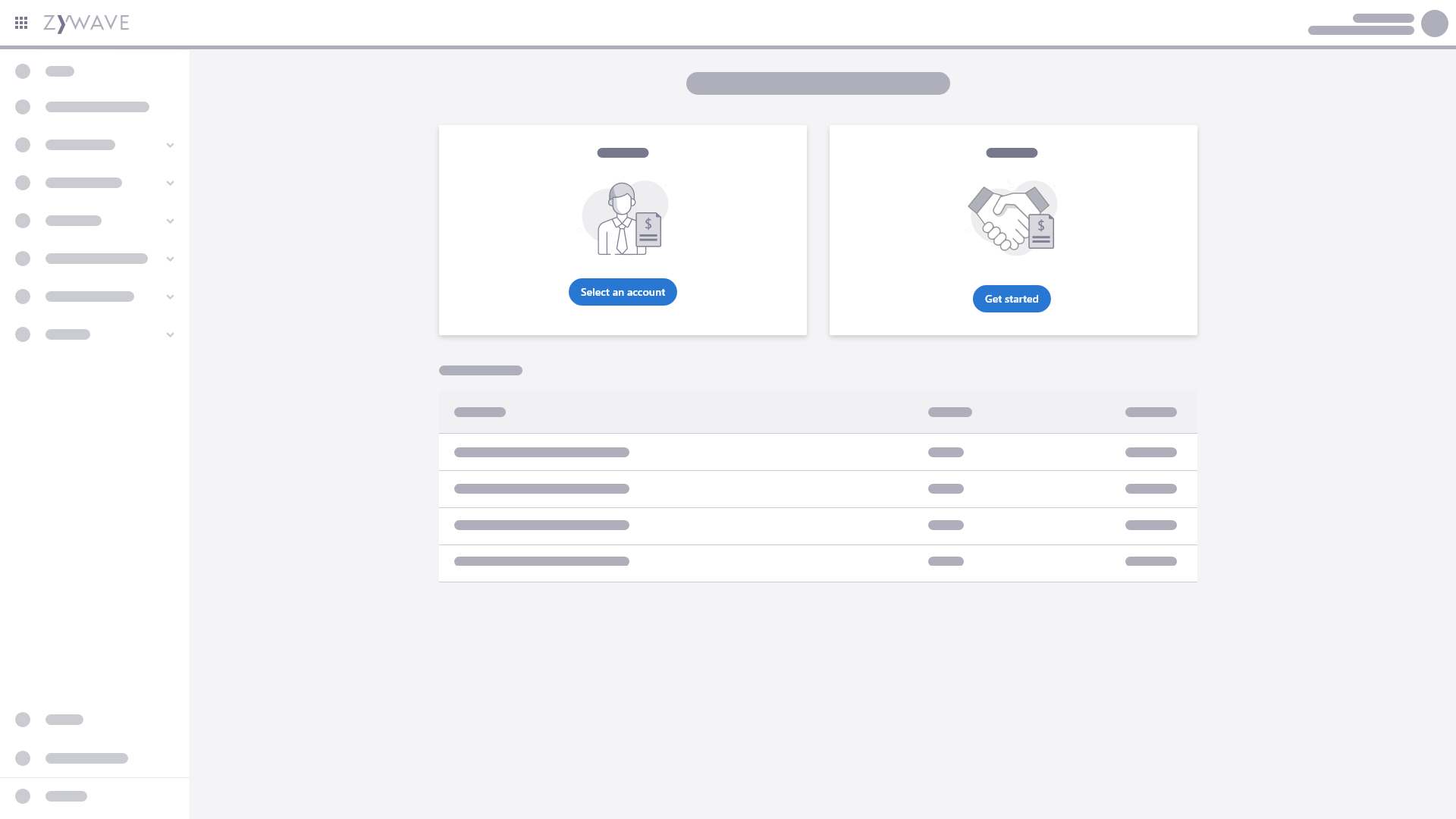
Actions within multiple cards can also be used when there is more than one entry point/path to the kickoff.
Setup
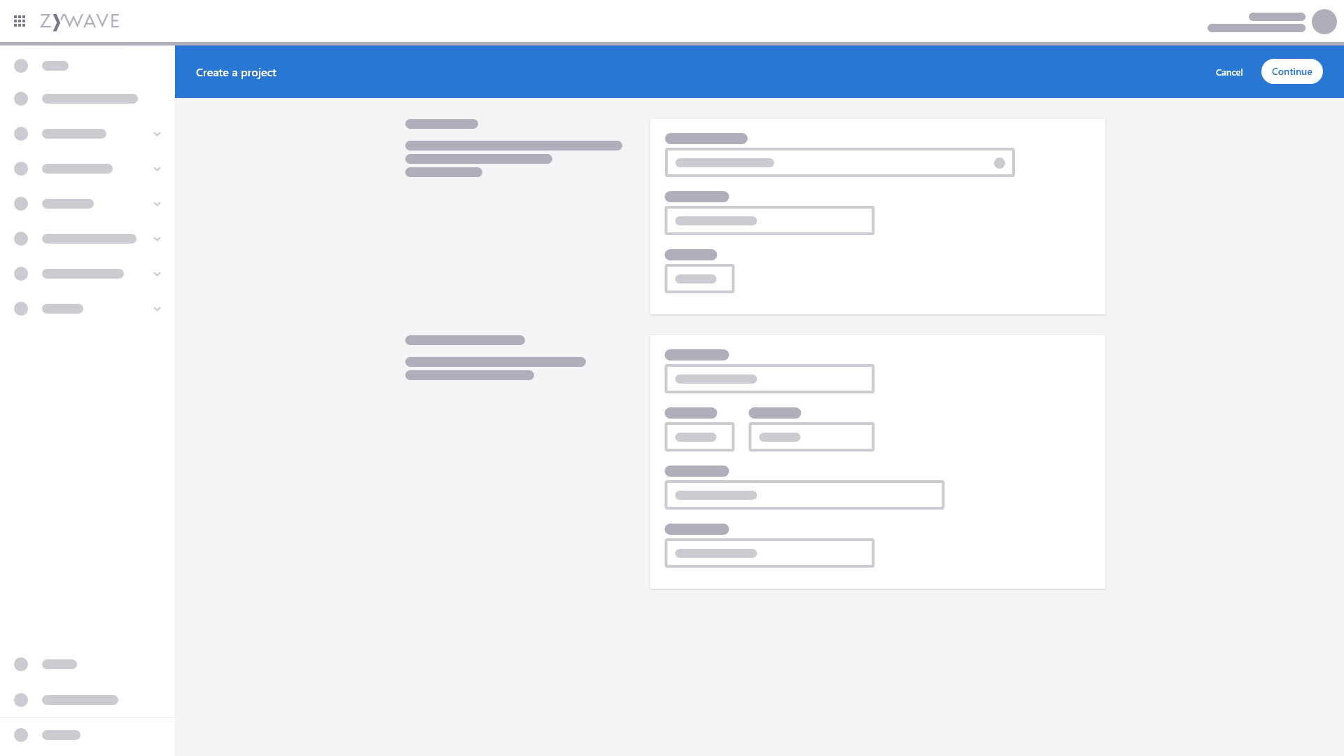
The Setup is where you can apply project-level settings and manage what content or data will be in the project. A form is typically used for inputting these high-level details such as account, title, and branding.
Part of the Setup may be to manage sections that will be included in the project. A table should be used when these sections can be reordered and managed individually.
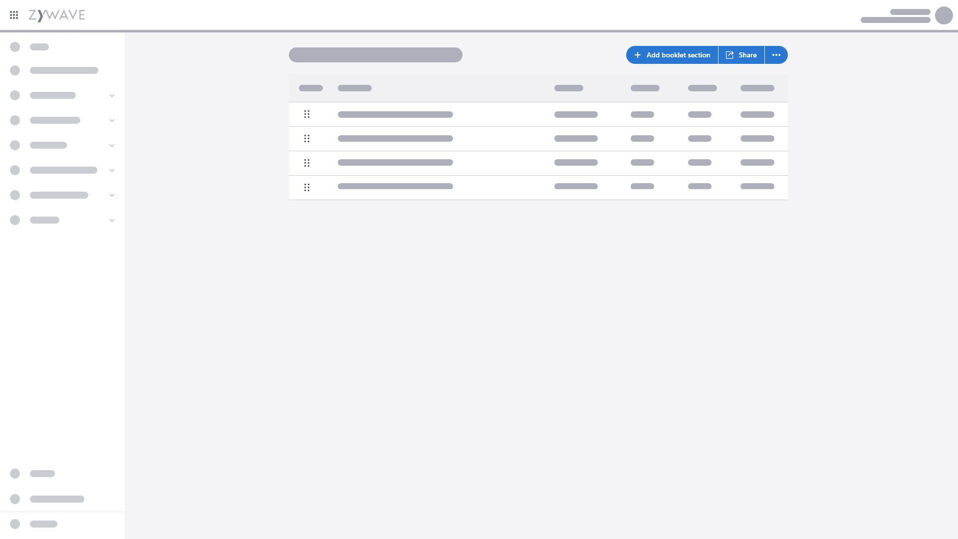
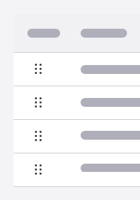
Drag and drop can be a helpful feature to organize data when hierarchy is relevant to the output.
Data entry
Data entry is where users will most likely spend most of their time. This layout will have the most variety in templates based on the project. In this step, users can input data, organize, and add/edit content.
In a well-designed Builder, users will only see the steps and the information relevant to their situation.
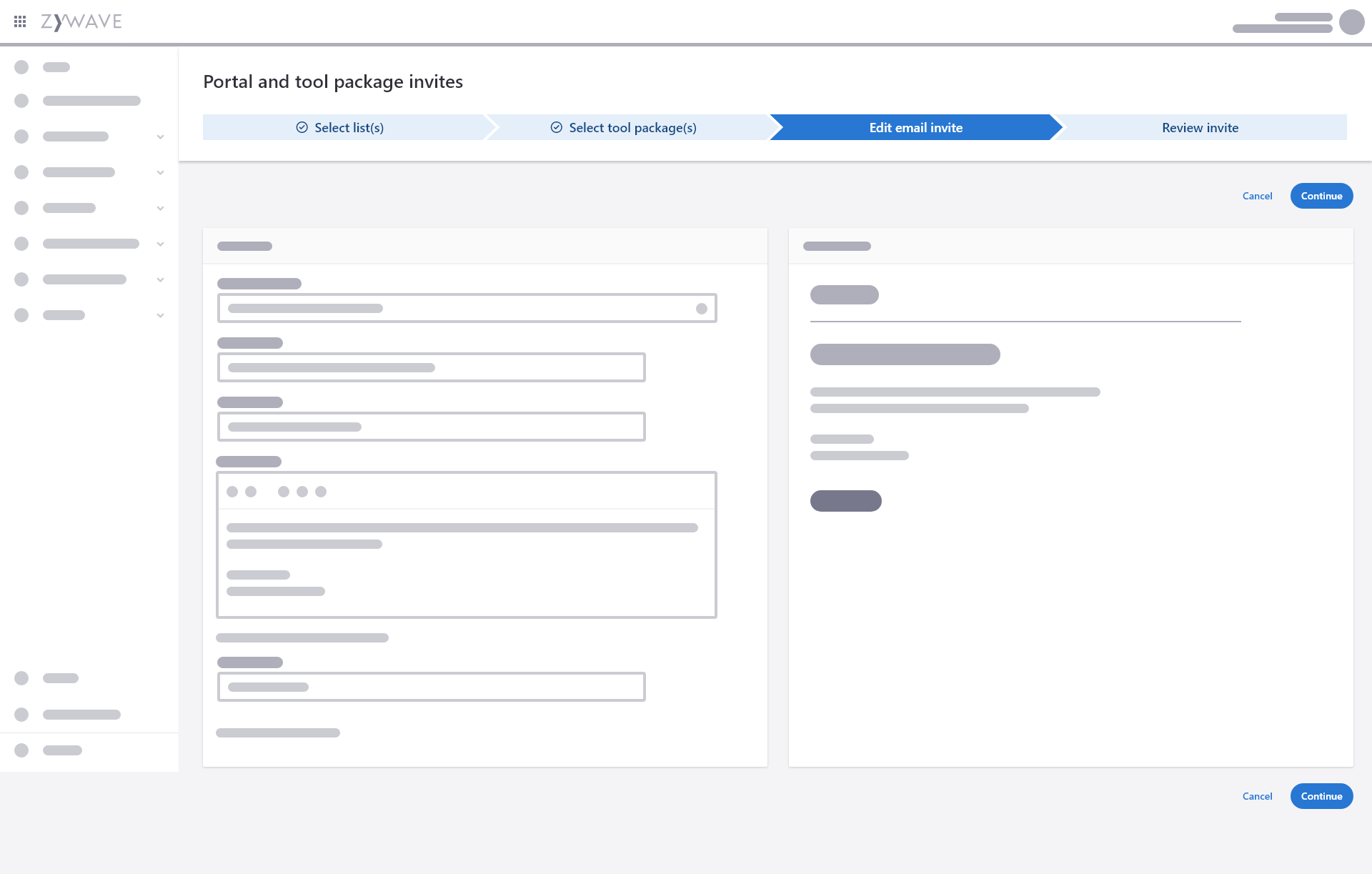
Progress indicator
Use a progress indicator when the user needs the ability to go back and forth within the workflow. Only use a progress indicator if you know exactly how many steps are in the process.
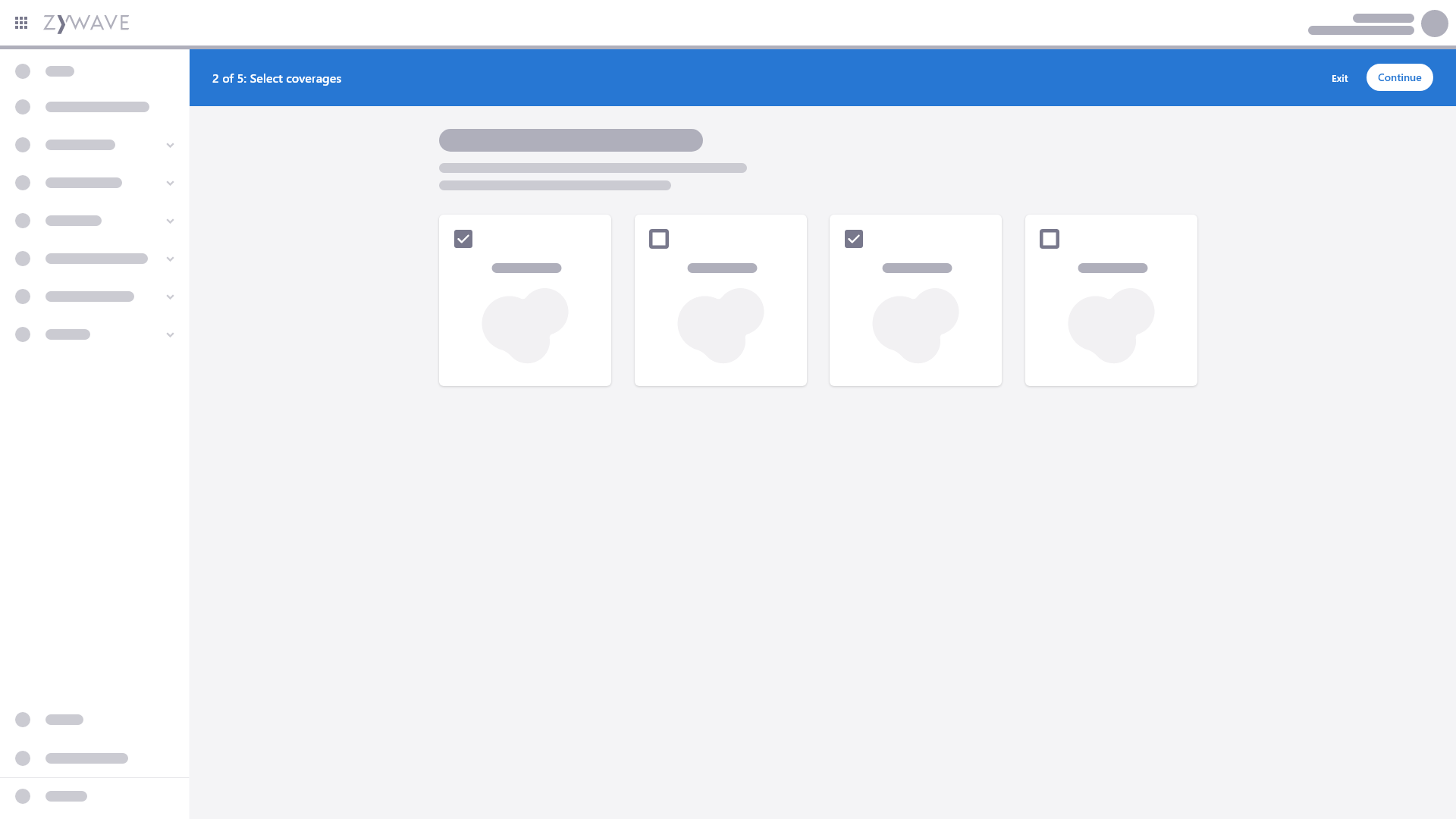
Action bar
Use an action bar when the user needs to take ordered steps to finish a workflow. The user is not allowed to skip steps. For more information, see Action bar documentation.
Template examples
To give some ideas on how to design this step, below are some examples of data entry templates.
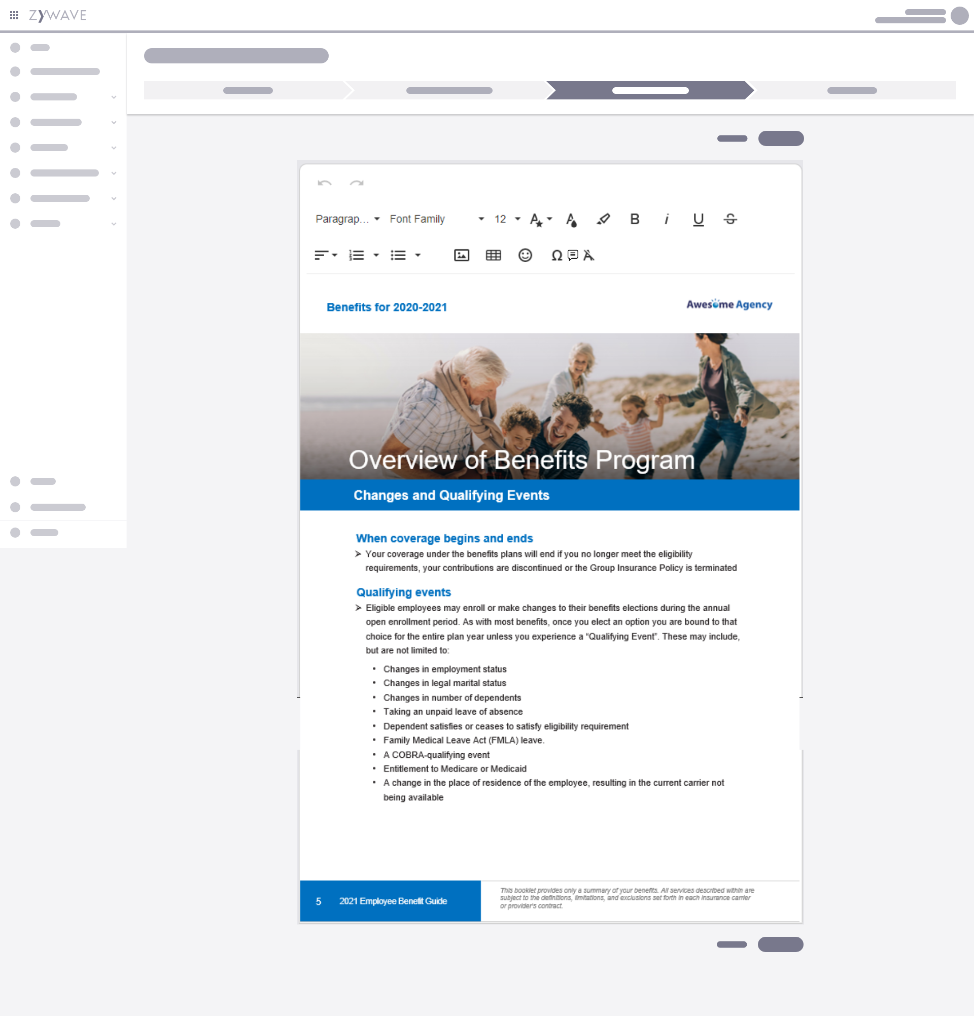
Single-column rich document editor
This example provides the user with a rich text editor experience to build and customize documents from scratch.
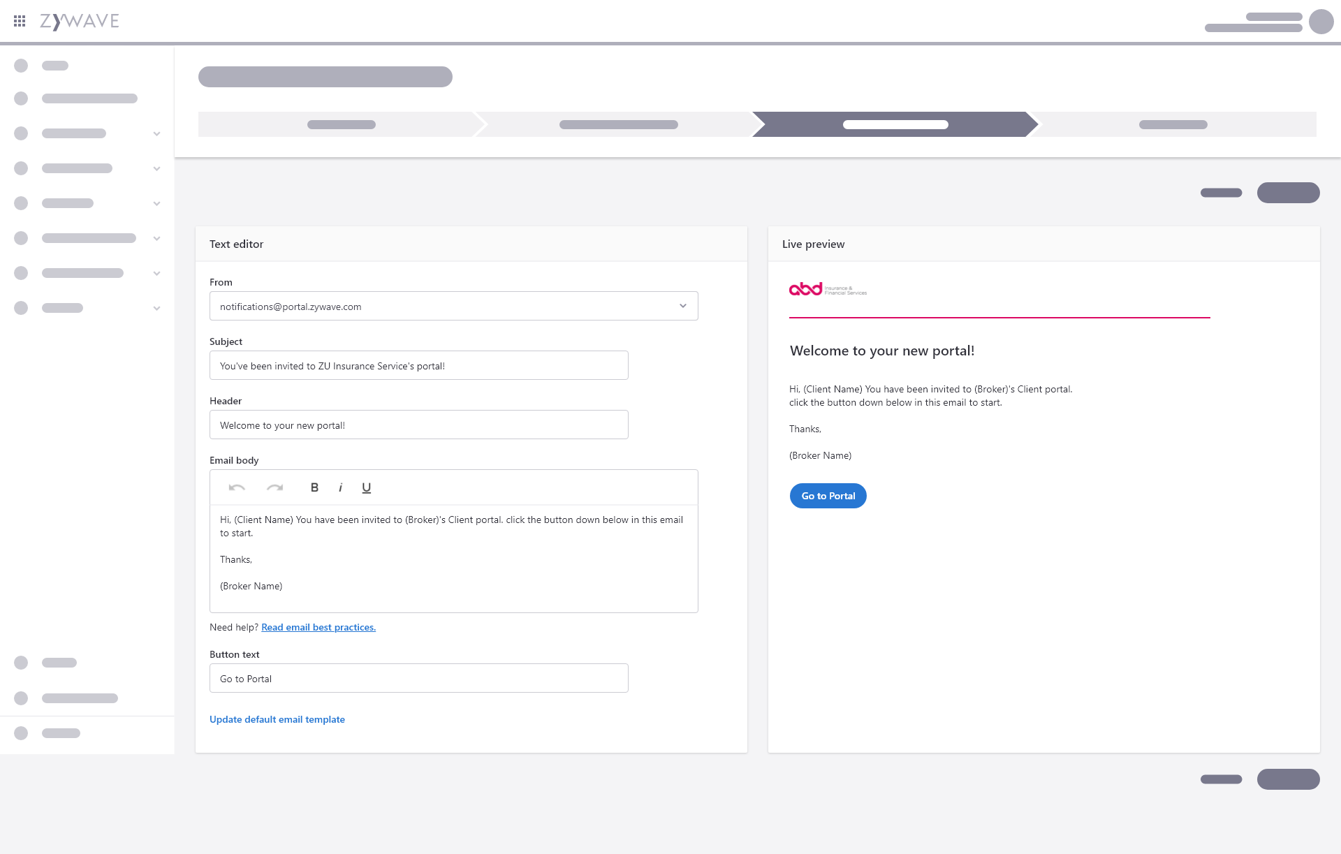
Two-column limited document editor
If multiple designs are available to choose from, this example allows the user to preview their custom email with a preset design.
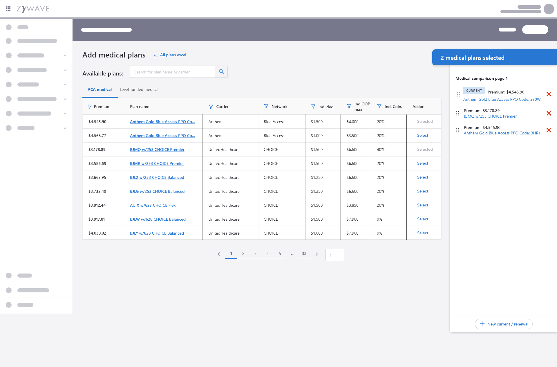
Fixed side panel
Use a fixed side panel on the right side when users need to manage selections in the workflow. This also helps to give users easy access to components or tools while still having a work area.
Generation
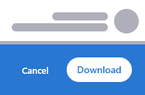
The final step in the document/presentation creation process is to generate an output. The user will need an action to begin the Generation step.
Use words similar to download or generate. Although, "generate" should typically be used when the user has to perform an action; or additional steps need to occur before the user receives the output.
Previewing before output
If there is no preview available during the Data entry step, consider implementing a way for the user to preview the final document prior to generating the output.
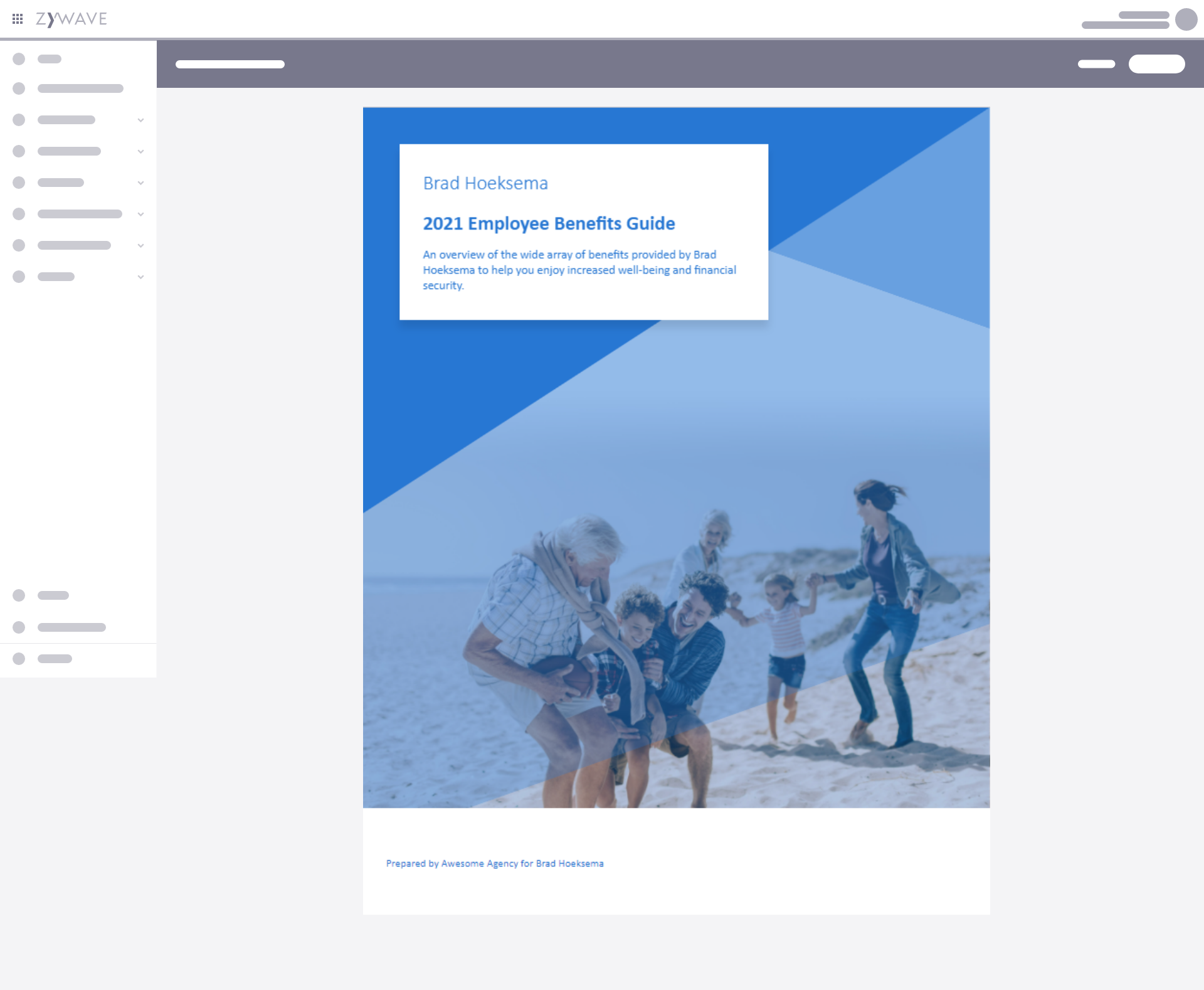
Full-page preview
Consider a full-page preview after data entry to allow users to go over their changes before generating an output. This preview could happen after data entry and right before generation.
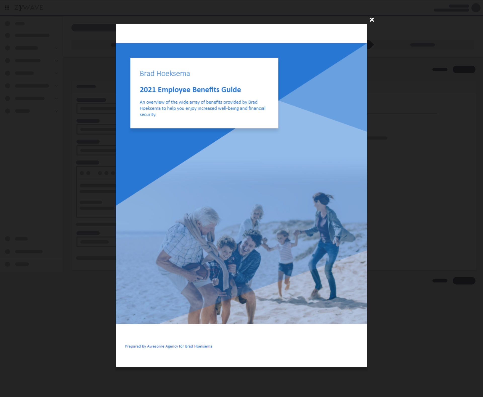
Dialog preview
Preview in a dialog to focus the user's attention on the preview itself and not to distract the user with other options.
Options for generating output
Providing output options, such as which format to download the final output as, can be beneficial for users.
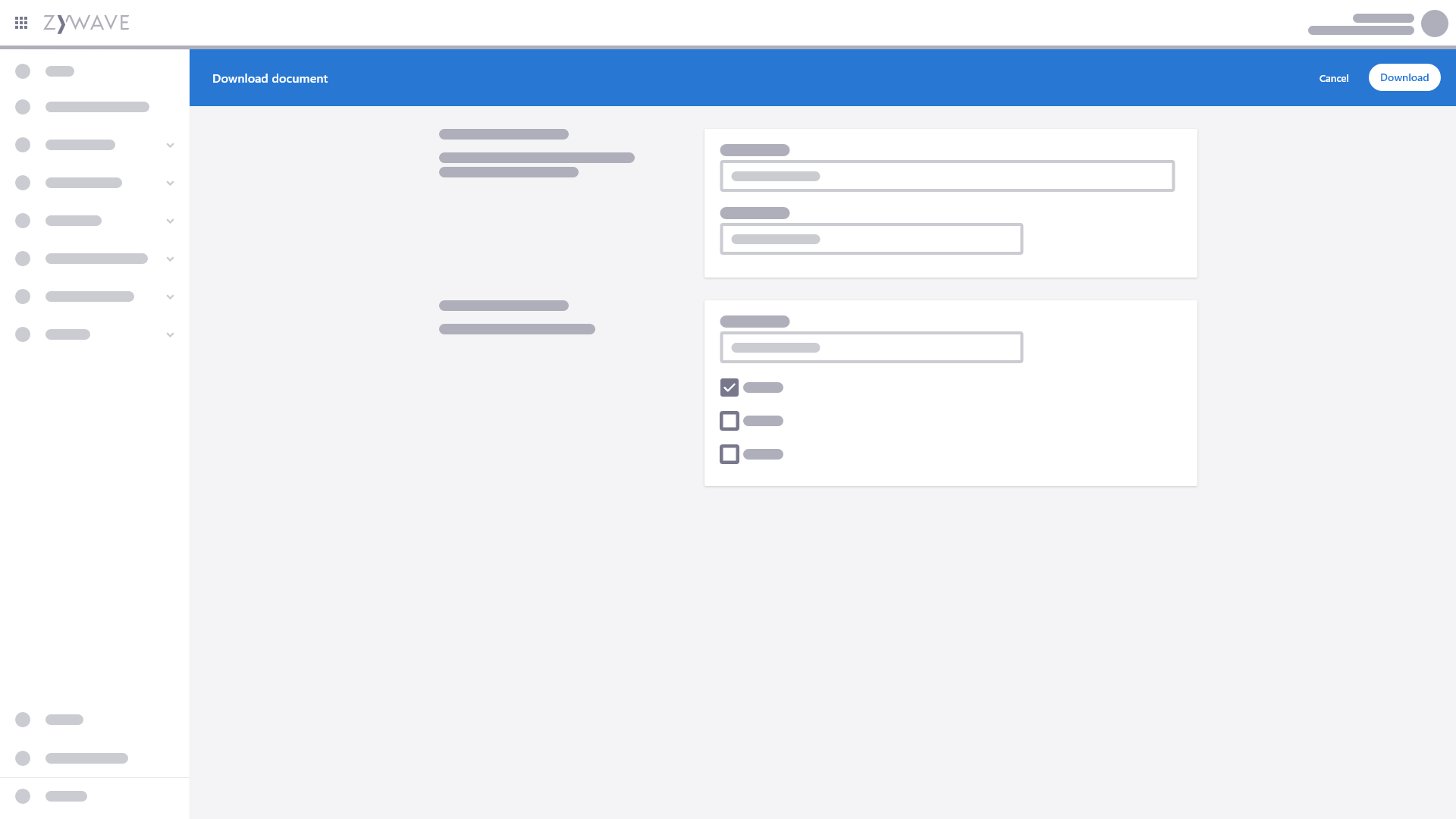
When only a few options are needed to download, use a button dropdown.
Loading experience while generating an output
When generating an output, there may be a need for a loading experience. Loading can be shown in various different ways: full page loading, progress bar in a notifier, progress circle in a dialog, etc. When a user will be notified by email upon generation completion, there may be no need for a loading state.
Consider the following when configuring loading:
- How long will the user wait before an output is generated?
- Which page or component is the user clicking on an action to produce an output?
Behavior
Exiting and returning
Ideally, a user would complete a step flow in a single, uninterrupted session. However, sometimes the user may want (or need) to leave before completing the step flow process.
- Designers and developers should decide whether or not the progress of an incomplete flow will be saved if exiting before completion.
- When the user clicks the exit button, a dialog will pop up to alert the user of the consequences for leaving (saving or not saving data) and asking for confirmation of the action.
A deep link into a step flow should take the user to the intro screen or if there is no intro, the first step of the flow.
The action on the completion screen always saves the user's work.
If returning to a saved step flow to edit or review information, you may want to include a text link that allows the user to skip straight to the end, or to the step flow's review page. This link would appear after reaching the end and returning to a previous step or exiting and returning.
