What are checkboxes?
Checkboxes are selection controls that allow the user to make multiple selections from a list of options. Unlike some other selection controls, checkboxes display all of the options, so the user has a chance to see all options before and while making their selections. They most commonly appear in forms.
Usage
A checkbox should be used when selecting zero, one, or more independent options from a list or to show a list of sub-selections. A standalone checkbox can also be used to select a single option in certain environments and situations.
Types

Standard Checkbox
Standard checkboxes are the most common types of Checkboxes. They allow users to make selections and quickly move on to the next task.
- Use when the number of options is easy for the user to process, generally fewer than 10.
- Checkboxes are small by nature, and they can be hard to click or tap. To help users make easier selections, make sure the clickable area includes both the checkbox and its label.
Gallery Checkbox
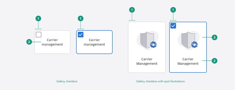
Gallery checkboxes are more prominent than standard checkboxes. They are generally used when they control the only selection the user can make on that page.
- Since Gallery Checkboxes can be significantly larger in size than Standard Checkboxes, they should generally be reserved for when that selection is the only one the user can make on that page.
- Spot illustrations are optional to use inside a Gallery Checkbox. They are used to both emphasize the selection and reinforce the contrast between the options.
Anatomy
For detailed documentation on our checkbox anatomy, view the checkbox design specs.
Standard Checkbox
The entire Checkbox can be interacted with to check or uncheck it.
- Checkbox: a visual indicator for the option when it has been checked or unchecked
- Label: a text description of the option
- Option: the combination of a checkbox and a label

Gallery Checkbox
The entire gallery Checkbox can be interacted with to check or uncheck it.
- Checkbox: a visual indicator for the option when it been checked or unchecked
- Label: a text description of the option
- Spot illustration (optional): emphasizes the option and reinforces the contrast between different options
States
Standard Checkbox states
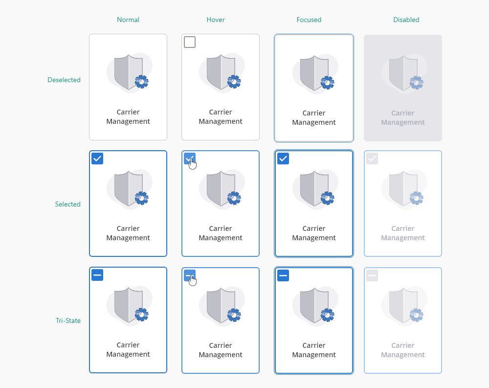
Gallery Checkbox states

Gallery Checkbox states - with illustrations
Normal
Normal state is the initial state of the checkbox when the page first loads and before any action is taken.
Hover
Hover state occurs when the user hovers over the checkbox with their mouse.
Focus
Focus state appears when the checkbox is currently selected and awaiting action. This commonly occurs when using a keyboard to navigate.
Disabled
Disabled state occurs when an action currently isn't available. Disabled checkboxes should only be used when an action can be taken within the current UI to enable the checkbox. If no action can be taken to enable the checkbox, then the checkbox should be hidden instead of disabled.
Best practices
Be consistent when writing Checkbox labels
- Make sure all Checkbox labels follow the same text format, such as sentence case, title case, etc.
- Avoid ending Checkbox labels with a period (.)
- Make sure all Checkbox labels follow the same pattern; which can be a sentence, a phrase, or a single word
Use positive wording for Checkbox labels
Checkboxes universally infer affirmation, not negation. When writing the Checkbox label, make sure to use positive and active wording so that it is clear to users what will happen if they click on the Checkbox.
Lay out Checkbox lists vertically
It is recommended that check lists be displayed vertically with one checkbox per line to better distinguish each option so they are easier to scan and read. If you must use a horizontal layout, make sure to space items out abundantly so that it is easy for users to associate Checkboxes with the correct label.
Use a Tri-State Checkbox when a list is partially selected
The indeterminate state is required to represent a partially checked parent Checkbox when some of its sub-options are checked.
Alternate considerations
- Use a dropdown multi-select if zero or more options can be selected and for lists larger than 10 items.
- Use a dropdown select if only one option can be selected and for lists larger than 10 items.
- Use a radio button if only one option can be selected and for lists smaller than 10 items.
- Use a toggle if the options are two opposing states such as a yes or no, on or off.
For more information on selection controls and keyboard accessibility view form standards.


